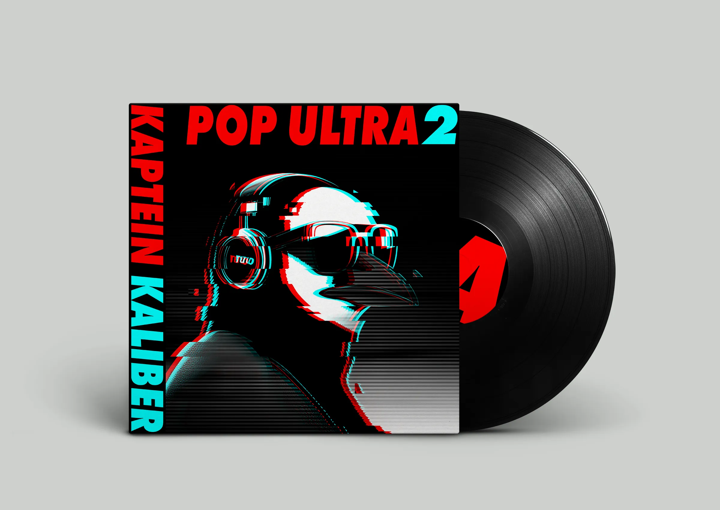
KAPTEIN K.

2.Project - Knut Hamsun 3.Project - mani design

01 Project goal and summary

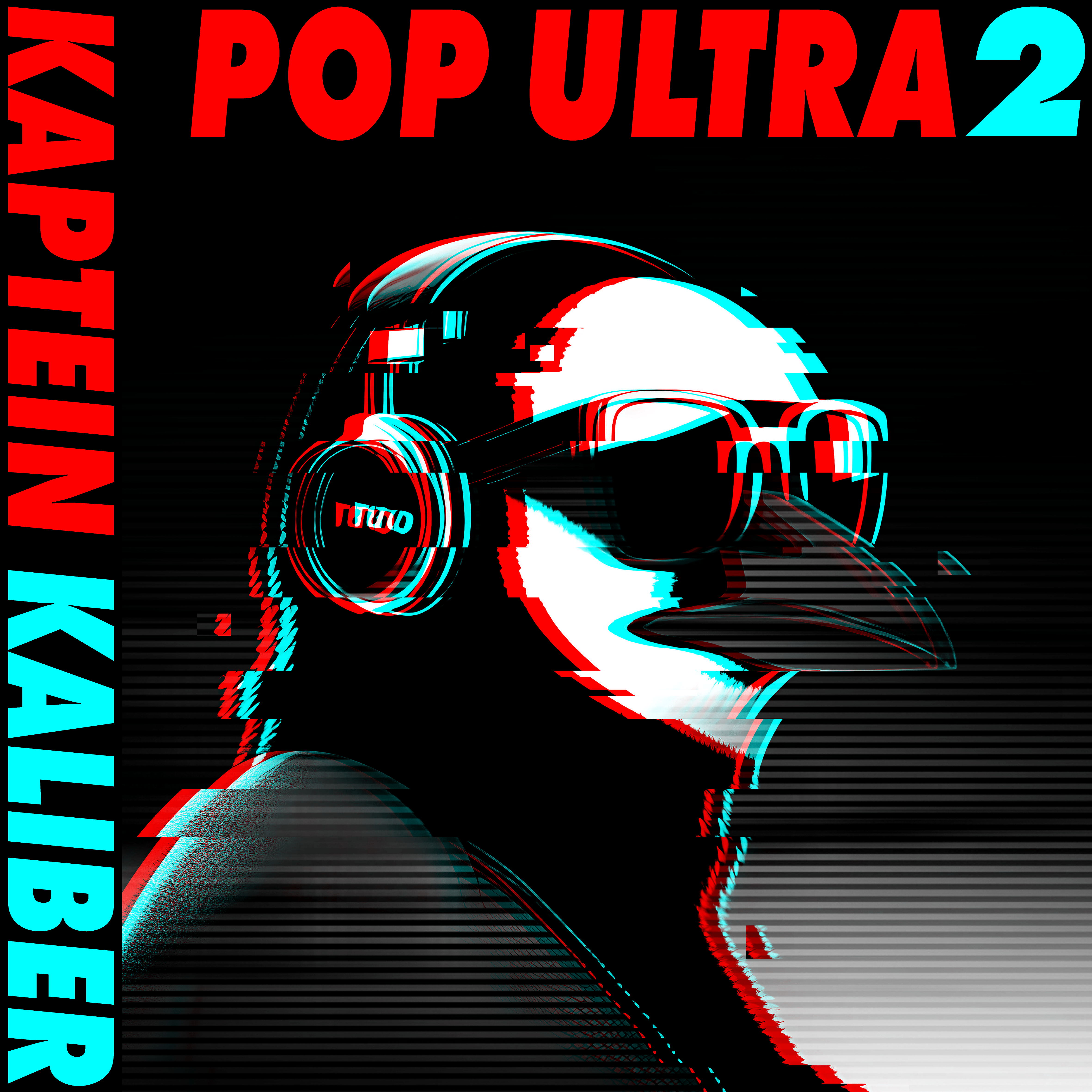
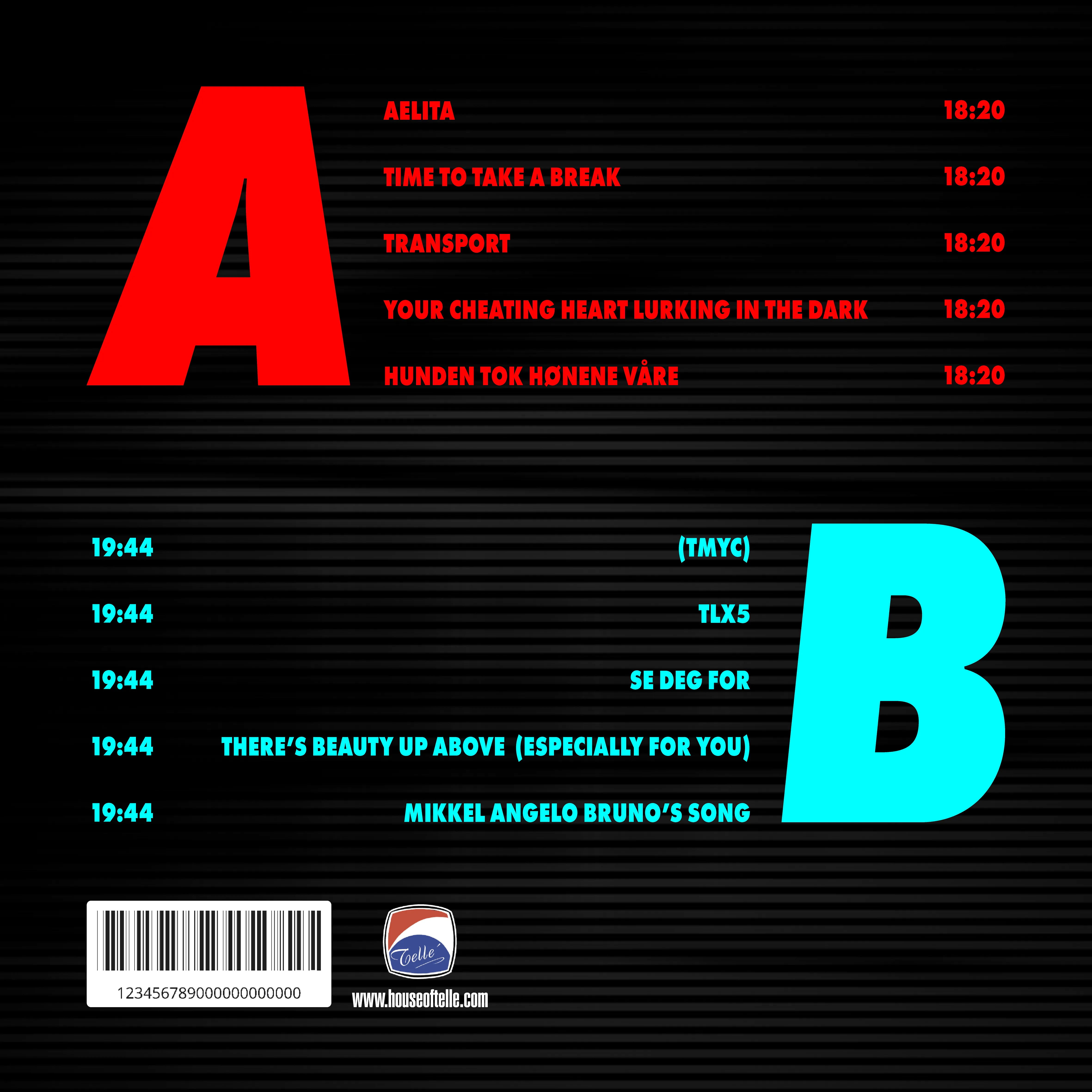
The aim of this project is to redesign the album cover Pop Ultra 2 by Kaptein Kaliber, focusing on developing a new visual and typographic identity that preserves the essence of the original design while transforming it into a more structured and graphically refined format.
Using graphic tools such as composition, grid systems, typography, and layout, I will create a double-sided album cover that balances the experimental nature of the music with a more modern and professional visual expression.
The redesign is specifically targeted at a demographic of young men in their 20s and 30s with an interest in electronic music, retro aesthetics, and visual culture. The design aims to capture their attention through a mix of nostalgia, glitch effects, and bold graphic elements — while presenting Kaptein Kaliber’s unique character in a new and clearly defined way.

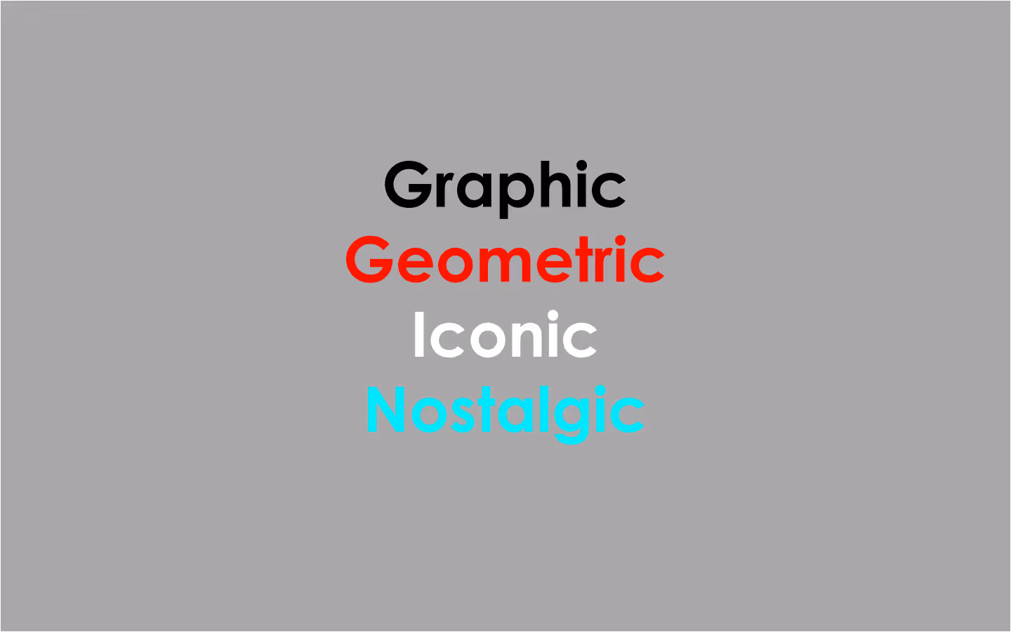
-Highlight the penguin as an iconic and recognizable visual element
-Further develop the visual language in line with the eccentric and playful character of the music
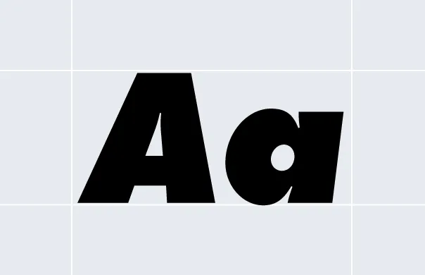
-Use typography as a core design element, introducing a new style and structure
-Explore the relationship between sound and visual identity, and translate the mood of the music into graphic form.

Consept

Kaptein Glitch 2023

Client

School project

Applied Skills

Typography, Layout and Composition. Understanding of Visual Identity

Made with

Photoshop, Illustrator

02 Personality

2a Tone of voice
Bold and graphic

Clear contrasts and strong visual cues.

Nostalgic with a wink

With intentional references to retro aesthetics and digital naïveté.

Geometrically organized

A visual structure that’s clear and ordered — but leaves space for disruption and surprise.

Iconic and memorable

With the penguin as a visual anchor and character carrier.

03 Color

The palette is bold, high-contrast, and digitally inspired — a modern interpretation of retro aesthetics, rooted in the neon universe of the 1980s and the lo-fi design of the early 2000s. The colors function both as graphic tools and mood carriers, strategically linked to the project’s core values.

Red – #FF0000

This red is geometric and energetic, used on the “Kaptein Kaliber” text and Side A. It cuts through the composition with force, creating contrast and rhythm. Red acts as the palette’s most aggressive element — injecting the design with pulse and intensity.

Aqua – #01FFFF

Used on the title text and Side B, aqua represents both nostalgia and futurism. It evokes CRT screens, VHS labels, and early digital graphics. The color also references electronic music and signal lights in dark spaces — a visual echo of synths and glitches.

White – #FFFFFF

White is used strategically in glitch effects and highlights on the penguin’s face and details. It functions as an iconic light source that draws the eye. It adds depth and definition, strengthening contrast in both typography and illustration.

Black – #000000

Black serves as the background and foundation — creating graphic, structural, and dramatic depth. It allows the other colors to shine and ties the layout together with a film noir–like darkness. It also adds a nighttime, club-like atmosphere that enhances the music’s mysterious tone.

This palette is clean, bold, and iconic — just like the music. The color choices are both functional and identity-defining, balancing between nostalgic references and digital aesthetics. The red–aqua combo creates a clear 80s/2000s mashup, while black and white provide graphic weight and legibility.

3a Primary Palette
Red
Hex: #FF0000
Aqua
Hex: #01FFFF
3b Secondary Palette
White
Hex: #ffffff
Black
Hex: #000000
3c Scanline

04Typography

1. Primary Typeface

Fututa - Extra Bold Oblique

Aa Bb Cc Dd Ee Ff Gg Hh Ii Jj Kk Ll Mm Nn
Oo Pp Qq Rr Ss Tt Uu Vv Ww Xx Yy Zz
0123456789
!”$%=()|[]:+?;

For this project, Futura Extra Bold Oblique was chosen as the primary typeface. Typography acts as a key design element, playing a central role in expressing the project’s core values and visual tone.

Futura was designed by Paul Renner in 1927 and is known for its geometric form language, inspired by the Bauhaus movement. The Extra Bold Oblique version gives the letters a powerful, forward-leaning character that feels both dynamic and contemporary — with clear references to retro-futurism and digital glitch aesthetics.

Graphic: The extremely bold weight and slanted style turn the type into a visual anchor. The text becomes form — not just content.Geometric: Futura is built on pure circles and straight lines, echoing the structural layout of the design and aligning seamlessly with the grid system.Nostalgic: The typeface carries a strong retro vibe, associated with 1980s design, album covers, and early tech interfaces.Iconic: The typography gains high visibility and distinctiveness — especially when used vertically and combined with color — contributing strongly to the cover’s iconic look.

05 Album cover

Album Cover Design:
Pop Ultra 2 (Redesign)
This redesign of Pop Ultra 2 is based on Kaptein Kaliber’s eccentric and experimental electronic universe, translating the music’s quirky, glitchy character into a clear visual identity.

Front Cover

The cover is dominated by the iconic MS Paint–inspired penguin — now reimagined with a 3D-like glitch filter and red/cyan stereo effect. The penguin has been updated with a more graphic and modern style, featuring detailed headphones, sunglasses, and a shadowy silhouette — a kind of electronic antihero. The “Kaptein Kaliber” typography is placed vertically and sliced midway — a deliberate break from convention, mirroring the unexpected turns in the music.Design approach: Glitch effects, high contrast, minimalist background
Color palette: Red, cyan, black, and white reinforce the 80s/2000s lo-fi aesthetic
Typography: Futura Extra Bold Oblique – slanted, heavy, and geometric

Back Cover

The back follows a clear grid-based layout, with tracks divided between Side A and Side B, each labeled with oversized letters in red and cyan. Side A is red and energetic; Side B is cooler and more curious — a visual interpretation of the album’s dynamic structure. Track names are set in the same typography and colors for maximum readability and rhythm.Graphic element: A striped, digital background simulates screen texture and scan lines
Typographic contrast: Caps lock + color coding = strong visual rhythm
Logo & barcode: True to the analog vinyl format, but placed with a digital twist

Mockup

The mockups present the design in a realistic context as a vinyl cover with record, giving the concept weight and credibility as a physical product. The front cover is shown with the vinyl partially pulled out, while the back reveals the tracklist and the digital Tellé Records stamp. The overall impression feels cohesive and authentic — positioning the design as both collectible and culturally relevant.

Summary

This redesign project strikes a balance between nostalgic visual play and graphic structure, translating Kaptein Kaliber’s quirky and playful soundscape into a cohesive and iconic physical expression. The color palette, typography, and digital glitch language together create a strong and memorable identity — breathing new life into the penguin for a new era.