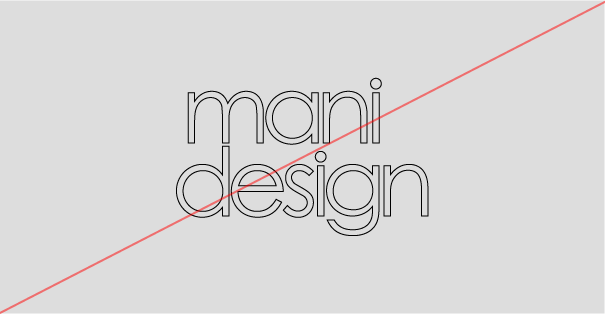
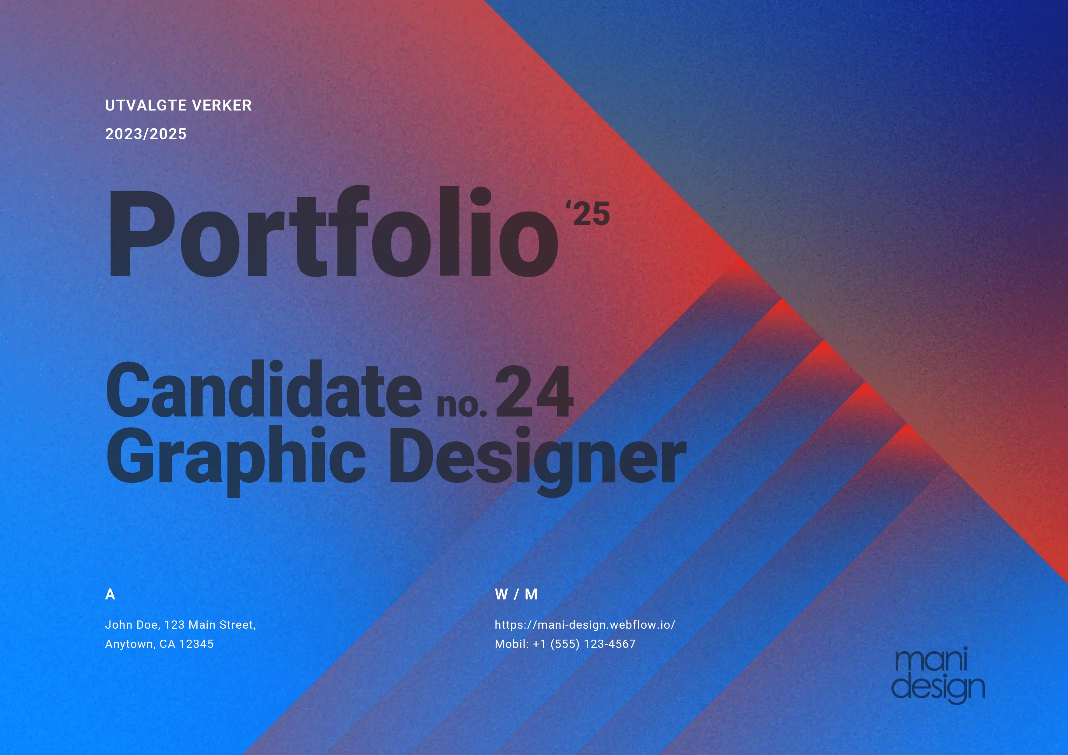
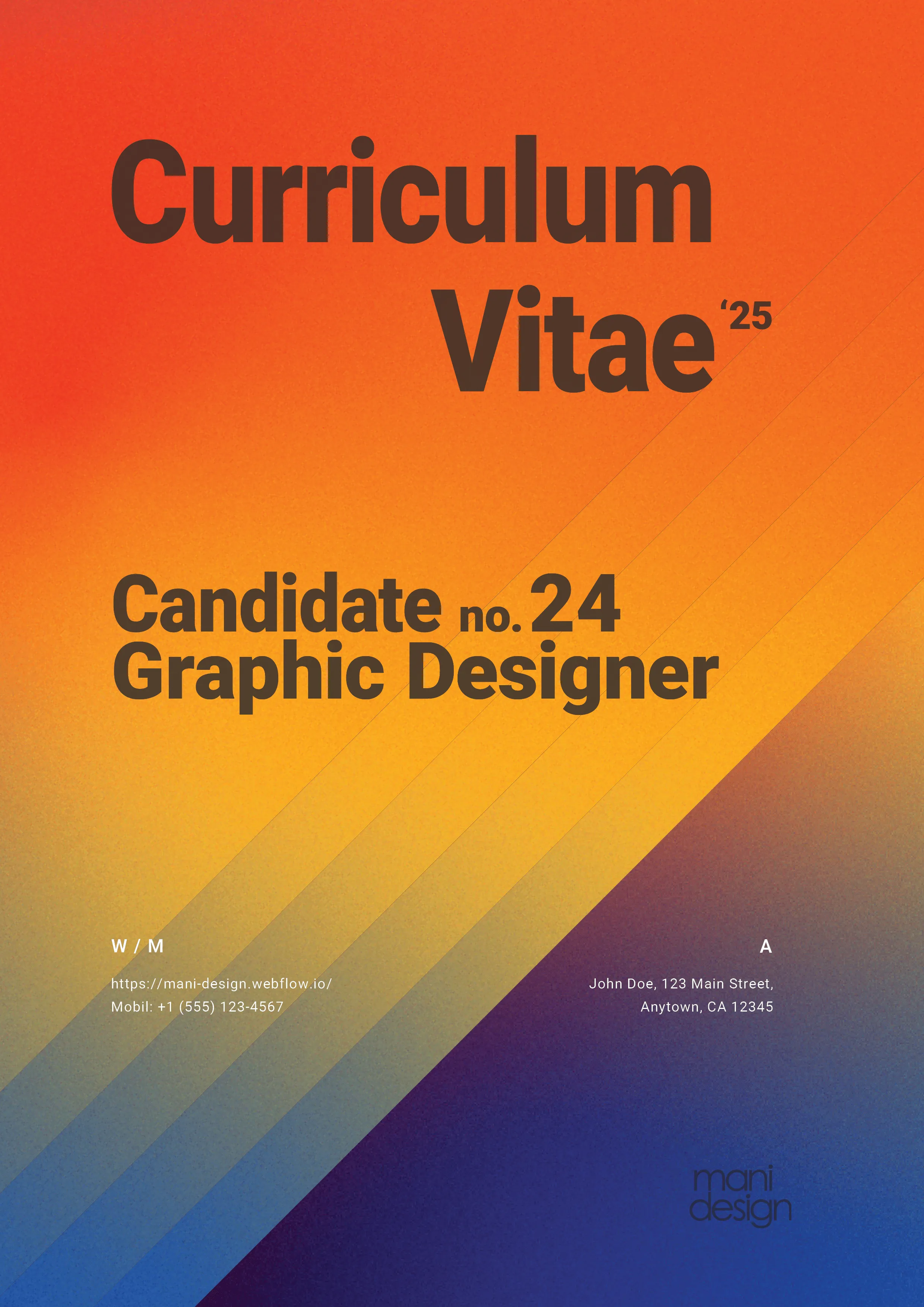
mani design

1.Project - Kaptein Kaliber2.Project - Knut Hamsun

01 Project goal and summary

The goal of this project is to develop a targeted and professional portfolio and résumé that effectively highlight my strengths, skills, and unique design expression as a newly graduated graphic designer. Through a visual identity and content tailored to the target audience — potential employers and collaborators in the design industry — I aim to clearly and convincingly communicate both my creative competence and my personal style

This project involved the development of a personal brand identity and a tailored portfolio as a newly graduated graphic designer. The process began with defining a clear brand personality that reflects my creative values and visual preferences. Based on this foundation, I designed a logo, established brand guidelines, and selected a cohesive color palette and typographic system. These elements formed the basis for my overall visual direction. The final portfolio combines strategic content choices with a consistent design language, aimed at showcasing my strengths, style, and skills to potential employers and collaborators in the design industry.

Consept

mani design 2025

Client

School project

Applied Skills

Identity Design, Storytelling, Self-Reflection, Web Design, Branding

Made with

Illustrator, InDesign, Figma
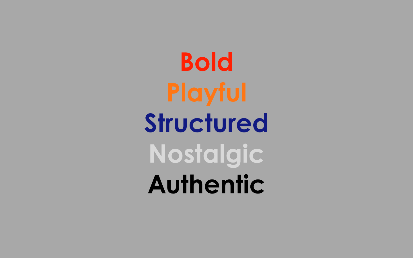
02 Personality

2a Tone of voice
Energetic, bold, and clear

mani design communicates with confidence and clarity. The language is expressive without being overcomplicated. It's direct — like a punchy headline on a retro poster. Every word serves a purpose, just like every shape in a layout.

Playful, yet grounded

There’s always a touch of playfulness in the way mani design expresses itself. There’s room to be a little cheeky, reference something nostalgic, or play with rhythm — as long as the message still lands. The voice has personality, but never loses control.

Nostalgic, but not outdated

mani design draws inspiration from the past, but speaks to the present. References to the 1980s may appear in visuals, themes, or tone — but always with a modern twist. Think: “Rewind the rules” or “Designed for the future, inspired by the past.”

Personal, yet professional

This is a brand built on identity — so the tone should feel human, honest, and creative. At the same time, mani design is a professional studio, which is reflected in clear language, thoughtful communication, and visual precision.

2b Slogans
“Design that dares to stand out.”
“Where geometry meets personality.”
“Not just retro — reimagined.”
“Bold ideas, built with structure.”

03 Logo

The logo of mani design is simple, clear, and full of personality — just like the brand itself. It consists of the name set in two lines, with “mani” above “design,” creating a compact and balanced form that works well in both small and large formats.

The typography is set in Century Gothic Pro Regular, a geometric sans serif typeface with roots in modernist design. Its clean, circular construction gives the logo a retro-futuristic feel, with strong references to the visual language of the 1980s. In particular, the letters a, g, and o give the logo a playful, almost iconic character.

The strength of the logo lies in its simplicity. It’s easy to recognize, easy to use — and it clearly communicates what mani design is all about: expressive, structured, and unafraid to stand out.

3a Wordmark Logo Design
3b Clearspace
3c Incorret Usage
Don't resize the mark
Don't rotate the logo
Don't colorize individual letters
Don't outline the logo
Don't flip the logo
Don't apply gradients to the logo

04 Color

The logo of mani design is simple, clear, and full of personality — just like the brand itself. It consists of the name set in two lines, with “mani” above “design,” creating a compact and balanced form that works well in both small and large formats.

Primary Palette

Ferrari Red (#ff2003) and Pumpkin (#ff7614) bring warmth, energy, and clarity to the brand expression. These bold red-orange tones evoke retro typography, pop culture, and the color saturation often seen on old screens and 1980s print materials.

Dark Imperial Blue (#111a82) provides a strong, grounded contrast to the warm hues, giving the design a structured and anchored feel. This deep blue adds depth and professionalism while giving the palette a distinctive and recognizable character.

Secondary Palette

The secondary colors are built around a wide range of grays — from White (#ffffff) and Light Silver (#d9d9d9) to Eerie Black (#1f1f1f) and Black (#000000).
This neutral scale acts as a visual buffer around the primary colors, offering flexibility in composition and typography. The grayscale provides space for balance, hierarchy, and structure — reinforcing the bold colors without competing with them.

4a Primary Palette
Ferrari Red
Hex: #FF1F02
Pumpkin
Hex: #FF7614
Dark Imperial Blue
Hex: #111A81
4b Secondary Palette
White
Hex: #ffffff
Light Silver
Hex: #D9D9D9
Silver Sand
Hex: #C2C2C2
Dark Grey (x11)
Hex: #A9A9A9
Philippine Gray
Hex: #8A8A8A
Eerie Black
Hex: #1E1E1E
Black
Hex: #000000
4c Gradient and texture

05Typography

1. Primary Typeface

Century Gothic Pro

Aa Bb Cc Dd Ee Ff Gg Hh Ii Jj Kk Ll Mm Nn
Oo Pp Qq Rr Ss Tt Uu Vv Ww Xx Yy Zz
0123456789
!”$%=()|[]:+?;

2. Secondary Typeface

Roboto

Aa Bb Cc Dd Ee Ff Gg Hh Ii Jj Kk Ll Mm Nn
Oo Pp Qq Rr Ss Tt Uu Vv Ww Xx Yy Zz
0123456789
!”$%=()|[]:+?;

Century Gothic Pro Regular

Century Gothic Pro Regular
Bold, geometric, and retro-modern. Sets the tone with character and clarity — inspired by 80s graphics and VHS covers.

Roboto

Clean, readable, and functional. Balances the boldness of Century Gothic with a modern, technical edge.

Typographic Concept

Structure meets personality. A dynamic duo that brings retro vibes into a sharp, professional context.

06 Art direction

The color palette is intensely vibrant — a mix of electric blue, warm red, sunny yellow, and deep purple — generating visual energy and contrast. Gradients and textures add a tactile, nostalgic quality, while every layout is grounded in structure and balance.

The shapes are often simple, but arranged in ways that create movement and depth. I use lines, arrows, and circles to build direction and rhythm — giving the design a sense of structured play. This reflects my personality as a designer: I enjoy working within clear frameworks, but love filling them with colorful personality.

Typography is clear, functional, and always placed with intention. It acts as a contrast to the energetic visual background — ensuring the message comes through with strength and clarity.Overall, the visual direction of mani design is both nostalgic and forward-thinking. It’s about taking the best from an iconic visual era and turning it into something personal and relevant for today.