VICTORIA
01 Project goal and summary
The aim of this project was to give Victoria by Knut Hamsun a new, modernist book design that preserves the literary depth of the work while appealing to contemporary Norwegian readers. The redesign included both the dust jacket and interior layout, with a focus on creating a cohesive visual experience.This project targets Norwegian readers who value quality literature and design. In a market where romance novels are often associated with clichés and low literary value, I wanted to elevate Victoria as a timeless and sincere love story — through a design expression that balances the classical with the contemporary.
In this project, I redesigned Victoria by Knut Hamsun with the aim of renewing the novel’s visual identity. Through the development of both the dust jacket and interior layout, I wanted to give the book a modernist glow while honoring the literary content with respect and depth.The design process included research into the role of romance literature in the Norwegian market, development of reader personas, and visual exploration through moodboards. The cover illustration began as an AI-generated image, which was then refined and further developed manually in Illustrator.
Applied Skills
Editorial Design, Print and Production Preparation, Book Design
Made with
Illustrator, InDesign
02 Personality
2a Tone of voice
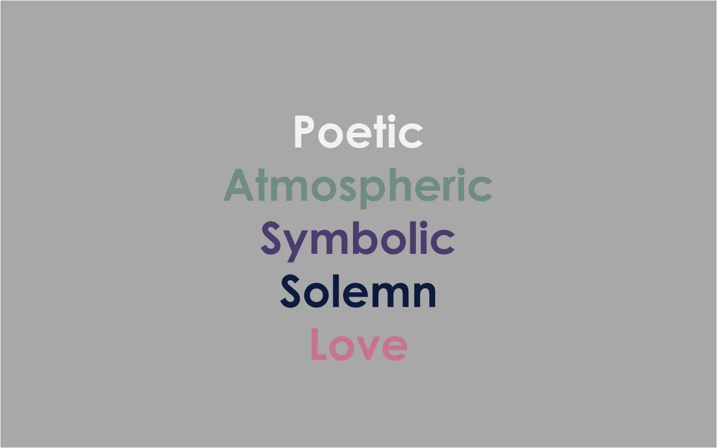
Poetic
The design should feel like a poem — not through words, but through form, color, and composition. It invites interpretation and emotion, rather than explanation.
Atmospheric
Mood is carried by the whole: the color palette, contrasts, and use of space. Dark surfaces, soft transitions, and quiet details create depth and presence.
Symbolic
Each element is meant to feel charged — but without shouting. Imagery, color choices, and typography suggest meaning without being literal. Every part has a purpose, though not necessarily an answer.
Solemn
The design is subdued and serious, yet never bleak. It conveys respect for the material and a timeless sense of dignity, without slipping into sentimentality.
Love
Love is not expressed as a theme, but as intention — through choices made with precision, care, and aesthetic awareness. The design should feel honest and sincere.
2b Slogans
“A cage, filled with flowers. Beautiful,
yet trapped. Like the love in Victoria.”
“The colors carry the emotion.
What’s unsaid lives in the details.”
“The design doesn’t shout. It whispers —
with the weight of an entire story..”
03 Color
This palette was developed to support the poetic and atmospheric expression of the book cover design. The colors reflect the complexity of love — from the deep and unresolved to the warm and hopeful. It balances darkness and seriousness with gentle contrasts that invite reflection.
Maastricht Blue – #0D1C3C
A
heavy, deep blue that carries weight and silence. It serves as the visual foundation of the design — evoking depth and mystery. The color suggests night, the unspoken, and the unresolved.
American Blue – #4C3B6F
Symbolic and emotional — this shade adds a subtle sense of drama. Purple often represents the spiritual and inner life, giving the design a quiet presence without overwhelming the viewer.
Charm – #C77191
A
poetic, warm touch that embodies the beauty and vulnerability of love. It is used with care to contrast darker tones and highlight emotionally charged details.
Anti-Flash White – #F2F1F0
A
neutral and soft tone that adds balance and space. It serves as a quiet backdrop for typography or smaller elements, creating breathing room between the more emotionally expressive colors.
Xanadu – #6F8C80
A
natural, muted green that bridges the serious and the living. It provides calm and balance, working well in details that should remain subtle yet meaningful.
Buff – #F5D689
A
soft and subdued warmth that evokes memory, light, and hope. Used sparingly to soften darker areas and introduce glimmers of light into the composition.
3a Primary Palette
Maastricht Blue
Hex: #0D1C3C
Anti-Flash White
Hex: #F3F2F0
Indigo (Rainbow)
Hex: #163B6A
3b Secondary Palette
American Blue
Hex: #4C3B6F
Amaranth Purple
Hex: #A13456
3c Complementary Colors
04 Illustration
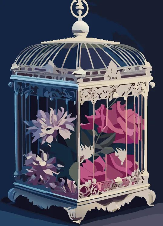
First pic: AI-generated using the prompt:
"Victorian bird cage", then imported into Illustrator.
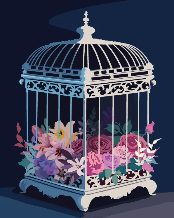
Last pic: The result after manual refinement and
development in Illustrator.
05Typography
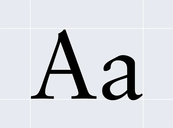
1. Primary Typeface
Lora - Regular
Aa Bb Cc Dd Ee Ff Gg Hh Ii Jj Kk Ll Mm Nn
Oo Pp Qq Rr Ss Tt Uu Vv Ww Xx Yy Zz
0123456789
!”$%=()|[]:+?;
2. Secondary Typeface
Sabon LT Pro - Roman
Aa Bb Cc Dd Ee Ff Gg Hh Ii Jj Kk Ll Mm Nn
Oo Pp Qq Rr Ss Tt Uu Vv Ww Xx Yy Zz
0123456789
!”$%=()|[]:+?;
Lora
adds warmth and poetic character to the title, balancing the rigid cage and floral illustration with subtle humanity.
Sabon LT Pro
Lends literary weight and timeless elegance throughout the layout, rooted in Renaissance book tradition.
A refined mix of classic and modern
Together, they create a symbolic and mature typographic tone that echoes the novel’s mood.
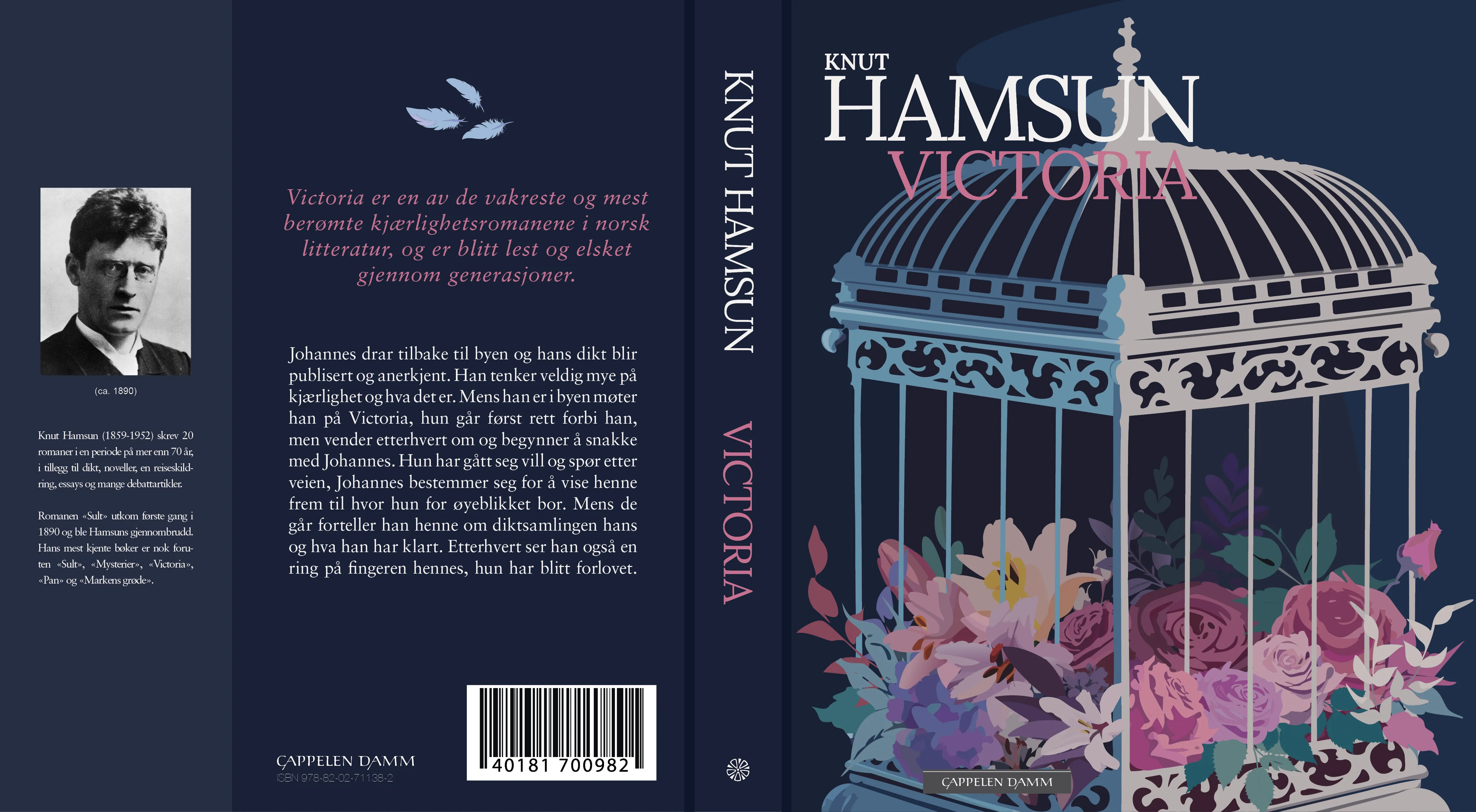
06 Cover design
The cover for Victoria is designed to reflect the novel’s poetic and serious tone through a symbolic and visually refined language. The central illustration — a decorated birdcage filled with flowers — becomes a metaphor for beauty trapped, echoing the story’s unresolved love and emotional depth. The dark background and rich tones add quiet melancholy, while the floral elements introduce desire and longing.
The curated color palette reinforces this mood: deep navy and lavender convey seriousness, while soft pink and pastel yellow add warmth and emotional contrast. The result is atmospheric and poetic — evoking love without falling into cliché.
Typography plays a key role in the emotional expression. Lora Regular, used for the title and author’s name, brings soft elegance and a modern, human touch. Sabon LT Pro – Roman, used throughout the rest of the cover, adds classical authority and literary weight.
An asymmetrical layout with generous spacing — including elements like the feather symbol, quote, and author portrait — invites reflection and adds a sophisticated balance. The overall visual experience is poetic, emotionally charged, and respectfully solemn — in line with Victoria’s status as one of Norway’s most beloved love stories.
07 Book interior design
The interior layout was designed to offer a cohesive and reader-friendly experience, extending the book cover’s poetic and serious tone with typographic refinement. The structure follows a classical approach, using deliberate design choices to highlight both content and form.
Structure & Layout
The interior is organized according to traditional book structure and includes:
– Half title
– Title page (title, author, genre, publisher’s logo)
– Colophon (copyright, printing details, typefaces, logos)
– Introductory quote page (Gabriola Regular)
– Chapter openers (chapter title, number, running head)
– Body text pages with running head and pagination
Each page is designed with a clear purpose and hierarchy, supporting both reading flow and thoughtful pauses.
Typography & Grid
The body text is set in Sabon LT Pro Roman, 10 pt — a classic, highly readable serif with literary presence. Running heads are set in small caps at 8 pt for subtle structure.The layout follows a 13 pt baseline grid with "align to grid" enabled, creating a consistent and orderly rhythm throughout the book. The text block is carefully balanced within the page to ensure generous margins, harmony, and breathing space.
The interior continues the mood of the cover design with a respectful and well-balanced composition. The open layout and symmetrical structure give the text room to breathe, inviting the reader into a calm and present reading experience. The quote page and chapter openers serve as visual and emotional transitions, enriching the journey through the novel.